
Help Julia Paint Her House
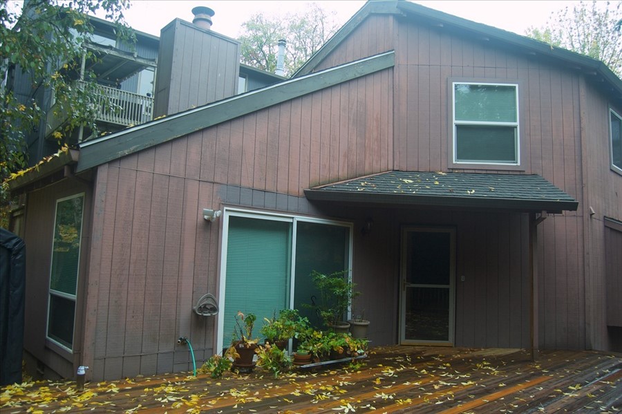
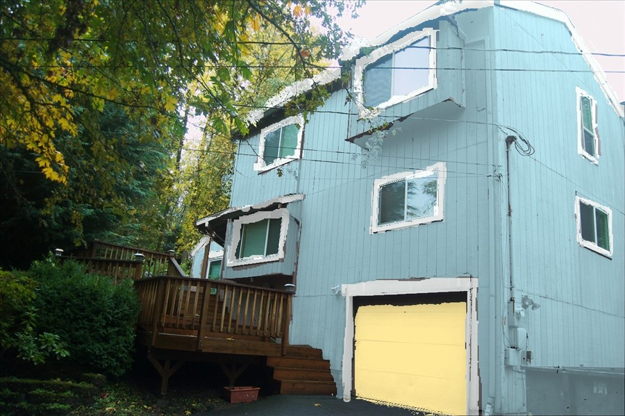
Painting the house has been high on my list of must-dos since I bought the house – the wood is starting to warp and really, really needs a protective coating over it, or I’m going to have to replace all of the siding, which I’m not eager to do quite yet.
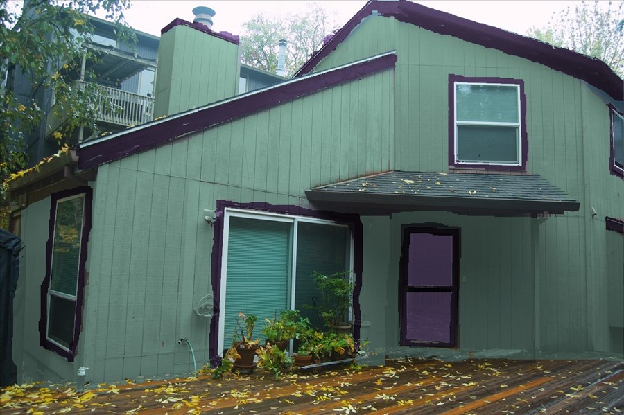
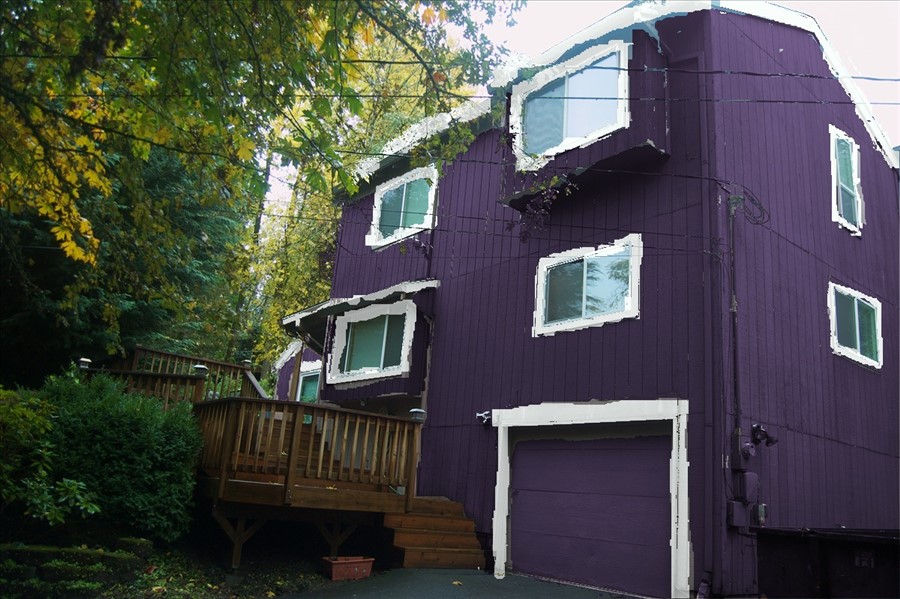
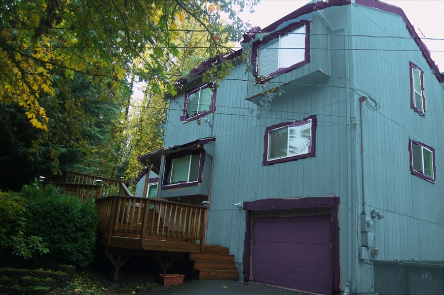
As a reminder, this is how my house is painted now (minus the replaced siding).

I finally found a company to paint. They’ll be coming in June, but as there’s all of these world-wide supply issues, I need to be picking out colors soon.
I’m a very indecisive person. After much (so much) hemming and hawing, I finally decided on an ocean blue with white trim and sunny yellow door: something that would remind you of the sea on a perfect day. Something similar to this:

However, when I went to get paint samples, they recommended very strongly not using those brilliant shades of blue on exteriors because they’ll fade within a year wherever there is sunlight and I have very uneven sunlight. Instead, they recommended “historical paint colors” that keep their colors better. Which are duller, at least on the paint chip.
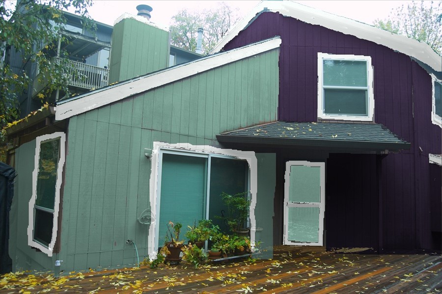
So I got three samples to try out on stock paper and on the side of my house when it stops raining: a light blue, a mediumish fern green (which is lighter than I thought), and a dark purple just to see if I wanted to go dark.
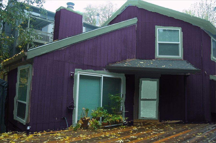
I honestly thought it was going to be a decision between the less vibrant blue and the comfortable green. And then I painted the purple on my sample boards and it’s this vibrant, gorgeous color that made my heart go pitter patter.
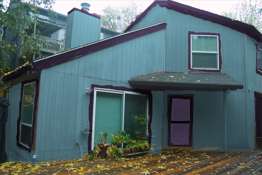
Here’s the light blue called Emily, with white trim and a yellow door. Not quite the “sea on a sunny day” but not terrible either.

There is a little bit darker blue called Meeting House, but I haven’t gotten that as a sample (yet). But it might be closer to my original vision:
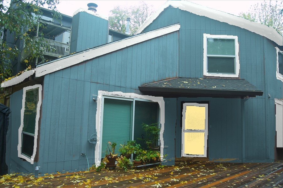

The light blue and the dark purple are a nice contrast. I’m not certain about the yellow door with the blue and purple.

The green, Viscaya, is a little lighter than I thought it was going to be, but it’s a really comforting fern green that goes well with the surroundings. The yellow doesn’t go at all with the green, so no sunny yellow door here. I think it needs a darker trim; white looks ridiculous, so I could go for the purple trim. Or a darker green or grey.

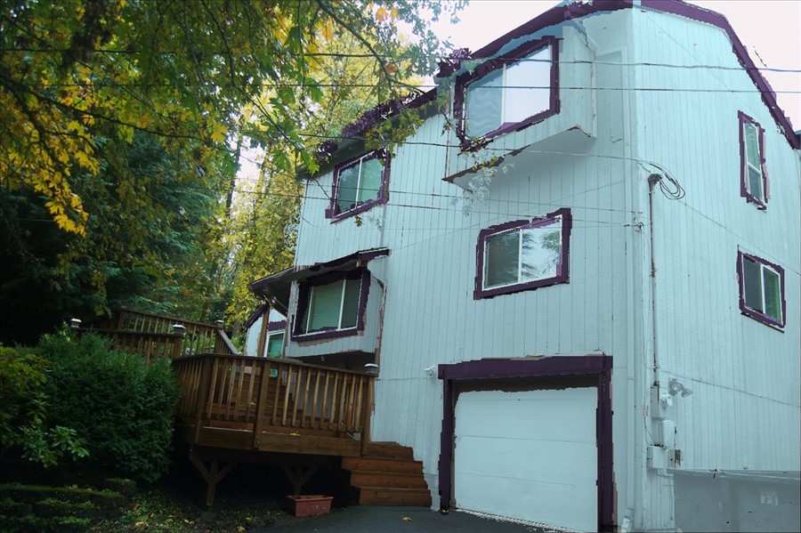
And finally. Purple. Dark, vibrant, gorgeous purple. It’s called Plum Island. I could do green trim or white.
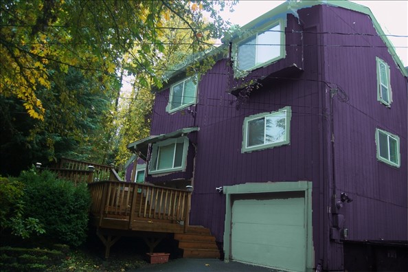

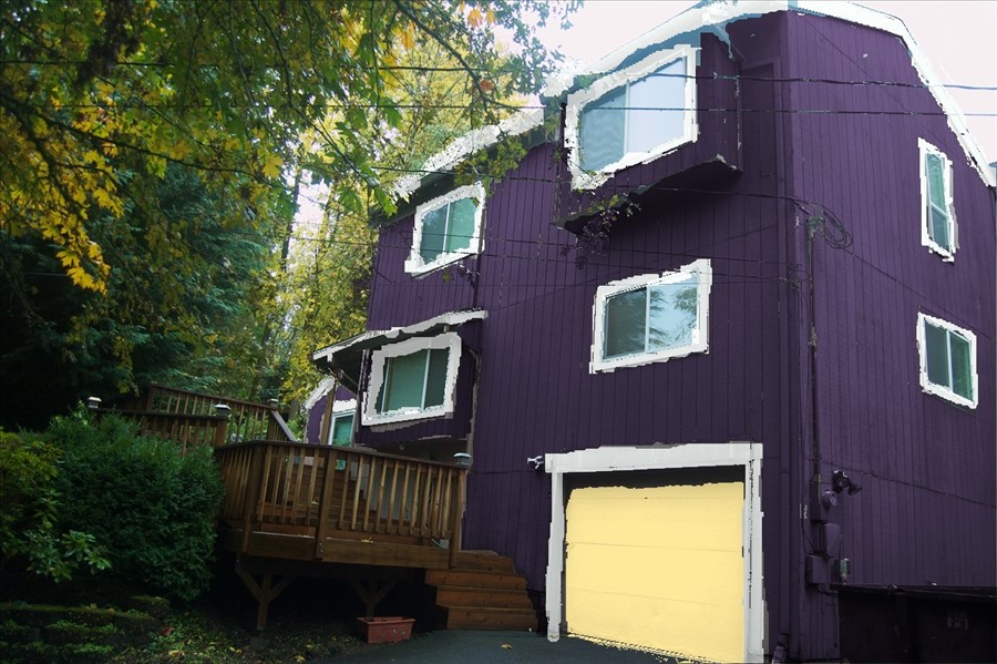
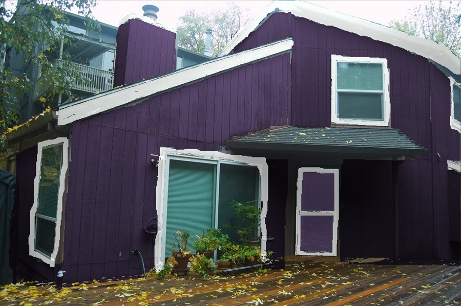
I’ve also explored painting the windows that jut out a different color. Or the living room that slants off.

The colors are from Miller Paint, a local paint company. Light blue – Emily #ABD1E1; medium blue – Meeting House #739DAD; green – Viscaya #7B9E98; white – Shell Tint #ECF0E9; and yellow – Lemon Zest #FFF1A5.
What do you think? What has your vote?